Is there an ideal election ballot, one written and designed clearly so that it is easy to read and use?
Yes. It has ten features.*
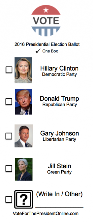
- The ballot uses mostly lower case letters. Why? ALL UPPERCASE LETTERS ARE HARDER TO READ compared to lower case letters.
- The names on the ballot, instructions, and other words are aligned to the left, not centered. With left-aligned type, it is easy for the eye to find where the next line begins. With center-aligned type, the eye has to work to figure out which is the next line.
- Font size matters. For ballots on a touch screen computer, type should be at least 25 point. For optically scanned ballots, type should be at least 12 point. Voters should not need magnifying glasses in order to read the ballot.
- Fonts should be sans-serif (a lettering style without those little tabs at the tops or bottoms of letters). Sans-serif type faces are cleaner and therefore quicker to read than serif styles.
- Optically scanned ballots should have instructions at the beginning and page numbers on every page. Touchscreens should offer continuous instructions (for example, at the top of each screen), language options, and a navigation system which is identical on every page of the ballot.
- Instructions should be presented in simple, easy-to-understand English (or other language). So should ballot initiatives, changes to constitutions, and proposed changes to tax law. Sample ballots should be available at polling stations so that voters can read complete written instructions and law changes before entering the polling booth.
- Visual instructions, such as an arrow indicating to turn the page at the bottom of a touchscreen ballot, should be obvious and consistent.
- Only informational icons, such as a stop sign at the end of the ballot, should be used—no elephants or donkeys.
- Color, boldfacing or boxing should be used consistently. For example, if instructions are in color or in a shaded box on page one, they should appear the same way throughout the ballot. However, color cannot be the only way to call attention to important information.
- Layout and text size should be used to indicate importance of information. For example, on the page of Presidential candidates, the words indicating a vote for President should be bigger and more obvious than the names of candidates. The candidates’ names should be bigger and more obvious than their party affiliation. Also, all candidates’ names should be presented equally in font size and darkness of font.
* Design for Democracy, a strategic initiative of AIGA, the professional association for design, developed these guidelines. AIGA worked with the US Election Assistance Commission and did testing on potential voters to develop these guidelines. Because holding elections is a function of the states and not the federal government, each state is free to create its own ballots according to its own criteria. After the election of 2000, many states changed their ballots to make them clearer, easier to use and less likely to be challenged.